

The organization
Best Friends Animal Society is the largest national no-kill animal welfare organization. Best Friends Los Angeles is one of the society’s regional shelters.
The challenge
Increase BFLA’s pet adoption rate

The solution
Responsive redesigned website. The new site makes it easier to learn more about the society and the adoption process, browse pets, apply online, and other essential adoption activities. New features were also added to drive the adoption rate.
Why this project?
This personal project began after a fellow designer and I saw a mutual friend’s Facebook post, in which our friend passionately preached about the importance of adopting pets from shelters and avoiding puppy mills. The reality of what she was saying resonated with us and we started chatting and looking into the issue. So many pets end up on the streets, or even euthanized, while prospective owners ignorantly spend their money at heartless puppy mills. We were curious as to how UX designers might help shelters more easily connect pets with new, loving owners. We wanted to better understand how pet shelters work and find out the motivations and pain points during people's adoption journeys. We decided to focus on improving the UX of one individual shelter’s website, and selected the Best Friends LA shelter. As a disclaimer, we have no affiliation with the Shelter itself.
My role
UX/UI Designer
Time spent
100 hours
The team
Two UX/UI Designers & one Researcher
Tools used
Figma, Photoshop, Illustrator
The process
Interviews with prospective pet owners
Competitive analysis & secondary research across online forums
Usability testing of existing Best Friends LA website
Creation of user journey maps
Ideation of new features to drive adoption rates
Creation of user flows and revised site map
Creation of wireframes, style guide & high fidelity prototypes

It’s too much effort for users to determine whether they can trust BFLA.
Over-the-phone interviews with potential pet owners helped us better understand what prospective adopters look for in deciding on a pet, their thoughts on adopting, past experiences, ideal process, and ‘need to knows’.

“Before adopting, I need to find an organization that I can trust."

“I need to know whether the organization’s values align with my own."
It became clear that for people who are not familiar with a particular organization or shelter, the most important first step is to determine whether the organization is trustworthy. Only then are they willing to start exploring pets.
How well did the existing site accomplish that? To find out, I conducted remote usability tests on the currently live version of the site.
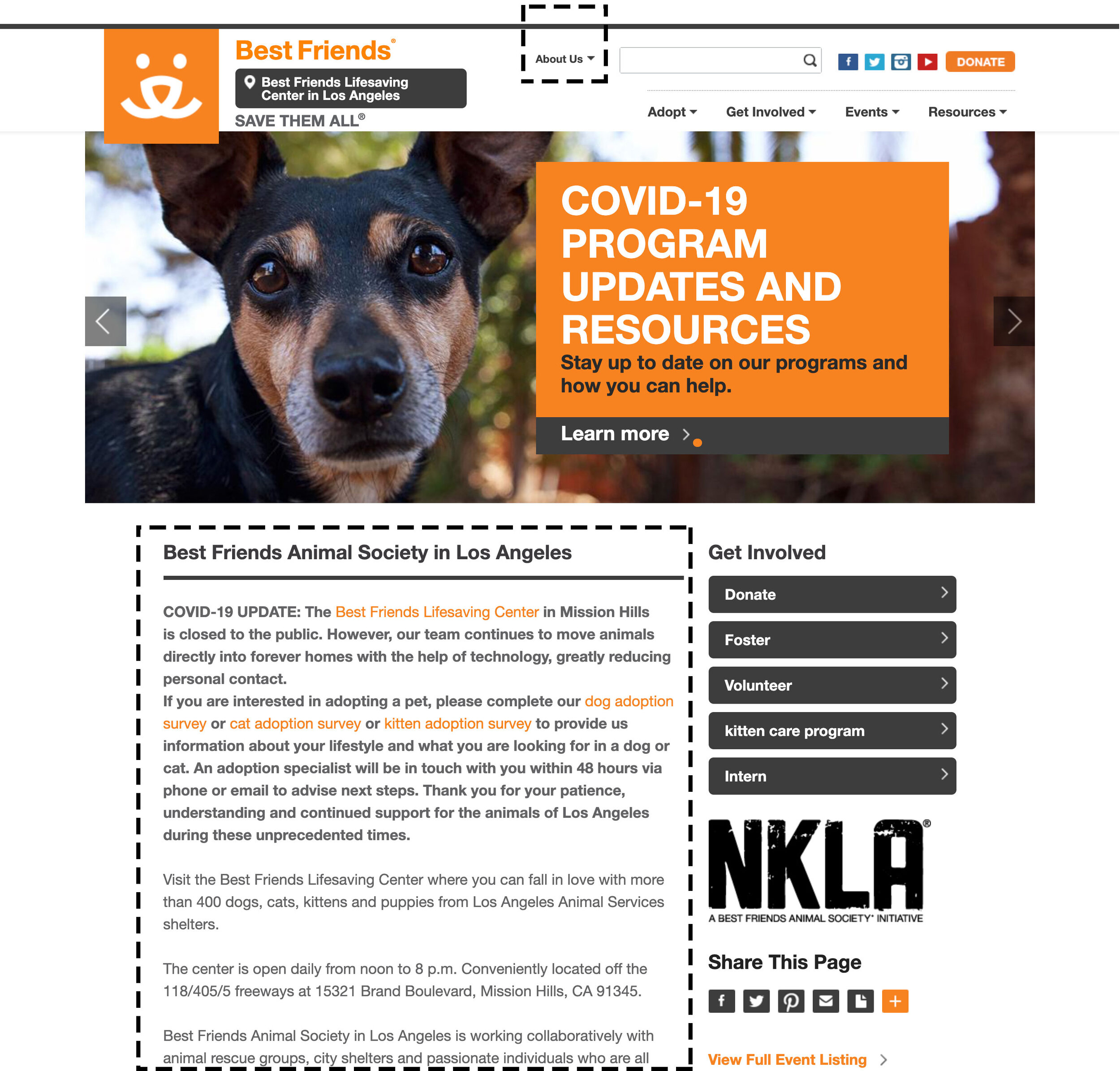

When test participants were asked to locate information about Best Friend’s mission and impact, only 1 out of 5 participants was able to find the information, located under 'About us', as it is not located within the main navigation bar and so was overlooked. Plus, any relevant content is constantly buried in dense blocks of text.
User testing also revealed that visitors sought out reviews and testimonials for the shelter, which do not exist on the current website.

Make key trust-related information easily findable on the site.
I reorganized the IA to make trust-related info more quickly findable (see appendix for updated site map)
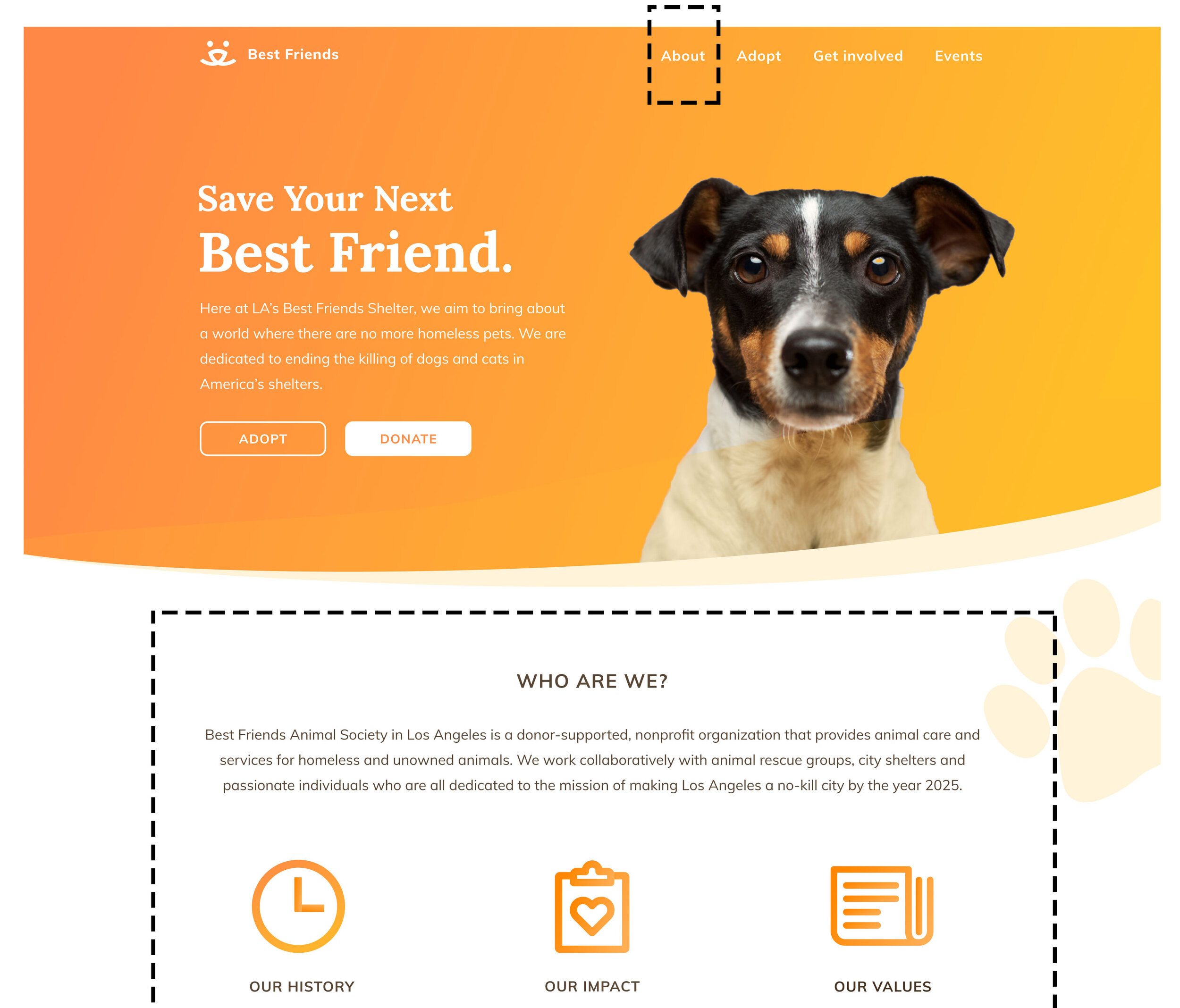
Moved 'About us' to the first item in the navigation bar.
Added highlights about the organization under the banner on the homepage. Then users can’t help but learn about BFLA’s history, impact, and values – all essential information for establishing trust.
Build trust by adding success stories.
I added a new “Happy Stories” section to the site, as testimonials where prospective adoptees can read about how other pets and their owners found one another and how the process worked out for them.


Potential adopters have doubts and hesitations that keep them from applying to adopt.
Once they establish trust with BFLA, potential adopters still need a lot of information. From our user interviews and secondary research, I learned more about what is important to potential adopters.

“I heard from friends that adopting is not very easy. I’d need all the info in advance so I can prepare!"

“Since I’ve never owned a pet before, I’d love to learn how to take care of it beforehand."
Overall, users are uncomfortable with uncertainty and seek to eliminate it from the overall process. More specifically, the following areas emerged where that uncertainty manifests:

The complexity of the adoption process
The need to fully understand how the adoption process works was shared by everyone we interviewed. We need to help users know what to expect in every stage of the adoption journey.

Fear of commitment
Most users are risk-adverse and view pet adoption as a big commitment. Having time to get to know the pets, either through shelter visits or a trial period appealed to all interviewees.

Post-adoption support
Interviewees who’ve never owned pets were concerned about their ability to take care of them. Like becoming a new parent, post-adoption support helps alleviate caretaking doubts.
Making information from these three areas clear and easily accessible on the website is extremely important as they are critical to the users’ decision-making process during their adoption journey.
So how easy was it to accomplish that on the existing site? To find out, I went back to usability testing.


In the study, 3 out of 5 users had difficulty finding the 3 key pieces of information outlined above. This is because the information was not easily discoverable and where it did appear, it was muddled in text-heavy form. Most participants expected to find it in the 'Adopt' drop-down menu. However, the options presented there did not include what they were looking for. What most users did not realize was that the word “Adopt” itself was actually clickable, and would link to some of the information they were seeking.

Make an easy-to-find, central repository for adoption info
To make information more easily and quickly accessible, the information architecture of the site needed to be reorganized to match the user's journey. To better understand this, I first created a user flow and a revised site map informed by that flow (see appendix).
With this knowledge, I created an Adoption dropdown menu with three clear sub-categories. When users hover/tap on 'Adopt', they have immediate access to all the resources they need to answer their questions and concerns at every stage of the adoption journey.
I also created a new, comprehensive Adoption 101 page with all the information and resources adopters need. This includes the process, fees, Foster to Adopt, and Post-adoption support section. This page also explains how adopters can get to know their pets better before making the big commitment.

Create new ‘Talk to a Buddy’ feature
The new ‘Talk to a Buddy’ feature lets potential adopters chat with established adopters. Being able to ask questions of someone who’s already completed the process can help to alleviate uncertainty and fear of commitment
Volunteer buddies can share their own experiences and answer any questions or concerns adopters have during any step in the adoption process. This can help to increase potential adopters’ odds of completing the adoption process as well as increase their engagement before and after adoption, creating a virtuous loop as the community grows.


Older, larger pets with health issues are largely ignored.
Expert interviews revealed that healthy young dogs under 20 pounds have an 99% adoption rate. So while it’s nearly assured that small young dogs will get adopted, older, larger dogs get left behind with little interest. Therefore helping less popular pets get noticed more could help to increase the overall adoption rate.

Featured pet on the homepage
A new 'Pet of the week' section on the homepage would feature older larger dogs. Dogs who have been sitting in the shelter with little interest would also be highlighted here. Our research showed that empathy is key in the decision making process, so quickly establishing empathy with these less popular dogs can help them to finally get adopted.

Show less popular pets first on search page
On the pet search page, pets that are normally less likely to be adopted (older, larger, health issues) will more frequently appear earlier in the results by default. By increasing the visibility of these pets, more users will see them and hopefully this will increase their adoption rates.


Dog profiles are difficult to scan for important information
From interviews, three characteristics emerged as most important to adopters in the pet search:


However, during our usability tests, 4 out of 5 users were not able to quickly locate these three items for a specific pet. This information was displayed in a manner that was often very text-heavy, and was not quickly or easily scannable.


Add character keywords and separate health history
On each pet detail page, I added tags of descriptive keywords about the pet's temperament/character (eg. energetic, curious) to help potential adopters quickly get a good sense of the nature of the pet and whether they’d get along with it. In addition, I also separated information related to the health of the pet into its own section so users can quickly find information related to the pet's health. With these two additions, users can quickly access the most important information regarding temperament, size, and health.

Lessons from this project
Designers hold the power to influence and guide users’ actions
As shown in problem #3, I changed the default pet search results to show larger, older dogs first. Then, on the homepage, I set the default donation amount to $100 in hopes of encouraging users to follow suit. These intentional choices to encourage virtuous behaviors in support of business goals made me much more conscious of similar little nudges across the web and how to responsibly use this practice on projects moving forward.
Get scrappy
As with every project, time is not a luxury that we had, so we found creative solutions to keep the project moving along. The other product designer and myself chose to create our layouts in Figma as this allowed us to simultaneously co-design, saving time and any unnecessary back-and-forth. We were able to test our designs much more quickly online using TryMyUI.com rather than finding users in person. Along the way, we consulted with UX/UI colleagues on various aspects of the layouts as needed, to ensure industry standards were being met.
The importance of anticipating the user’s mental processes
Potential adopters have plenty of objections and stumbling blocks in the decision-making process. So we attempted to meet the users’ thought processes head on in terms of what content each page would include and how the pages would fit together. For instance, we knew that an adopter might still be on the fence after viewing a pet, so on the pet’s profile page we included not only a primary CTA to adopt, but also the chance to meet the pet if they still weren’t sure. Or, if something else was an issue, we prompted them to ask the shelter a question.
Final hifi prototype
Appendix
INFORMATION ARCHITECTURE
Site Map
I restructured the organization of the site to make it faster and easier for users to intuitively find information about the adoption process. This was accomplished through user interviews, user testing of the existing website, and competitive analyses to discover best practices.

INTERACTION DESIGN
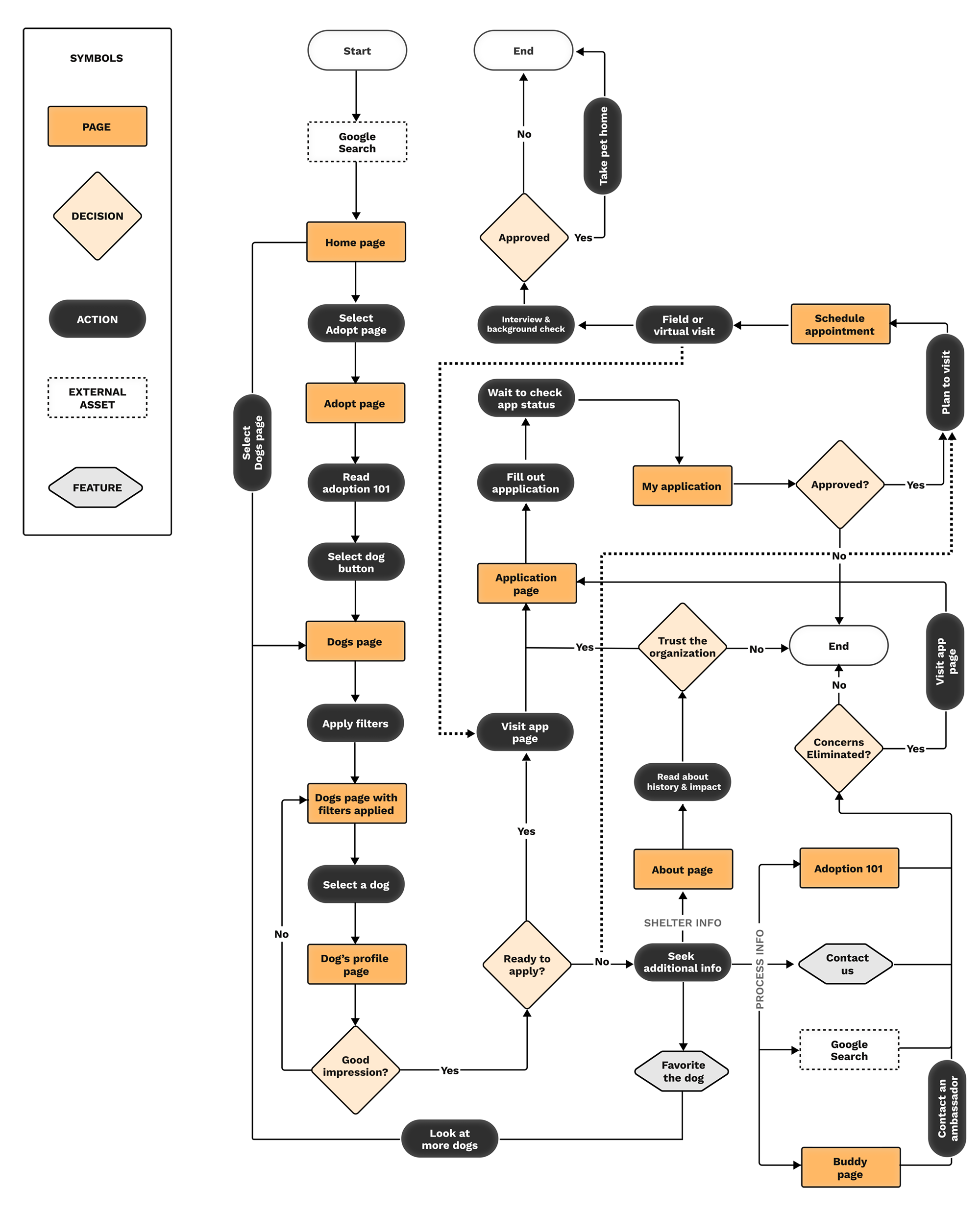
User Flow
I wanted to better understand users’ journeys through and interactions with the Best Friend website. To accomplish this, I created a user flow to map out their actions throughout each step of the journey. The below user flow represents a user who is looking for a pet to adopt; this particular user was referred to BFLA via a trusted friend.
PROTOTYPING & TESTING
Wireframes
Using the information from the revised site map and user flow, I created low-fidelity wireframes to validate our approach with users. Low-fidelity prototypes allowed us to gather rapid feedback from users without investing too much time on high-fidelity designs or development.

UI Design
Design System
I maintained the logo and orange color as core elements of the established BF brand. Before creating high-fidelity comps, I wanted to establish our complete design system that could be carried out throughout all the pages of the site. This was important for consistency, and allowed myself and my co-designer to work quickly and efficiently once created as symbols.


INTERACTION DESIGN
Form design
From usability tests, we learned that the adoption application needed some work. First, the terminology was confusing. It was referred to as a “matchmaking survey”, though what did this mean if you already had a particular dog in mind, and didn’t want to be matched with a panel of dogs? Users liked that a lot of information was required, since it meant the shelter really took every aspect into account in ensuring a good match. However the existing long, endless scroll format was a bit overwhelming. If they finally did submit the form, it wasn’t clear what the next step would be and if/when they would hear back from the shelter.
So I renamed it clearly as an “application form”, grouped questions into four different categories appearing on separate pages, and included a progress bar. The redesign also lets users know what the next step is once they’ve clicked submit.

Old application form

New application form